Fast food restaurant chain
WOOBRO created a WordPress website for the catering branch of the largest Asian-segment restaurant chain in the United States.
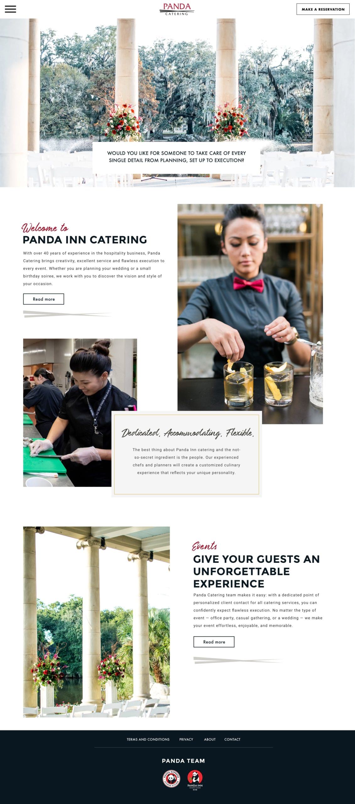
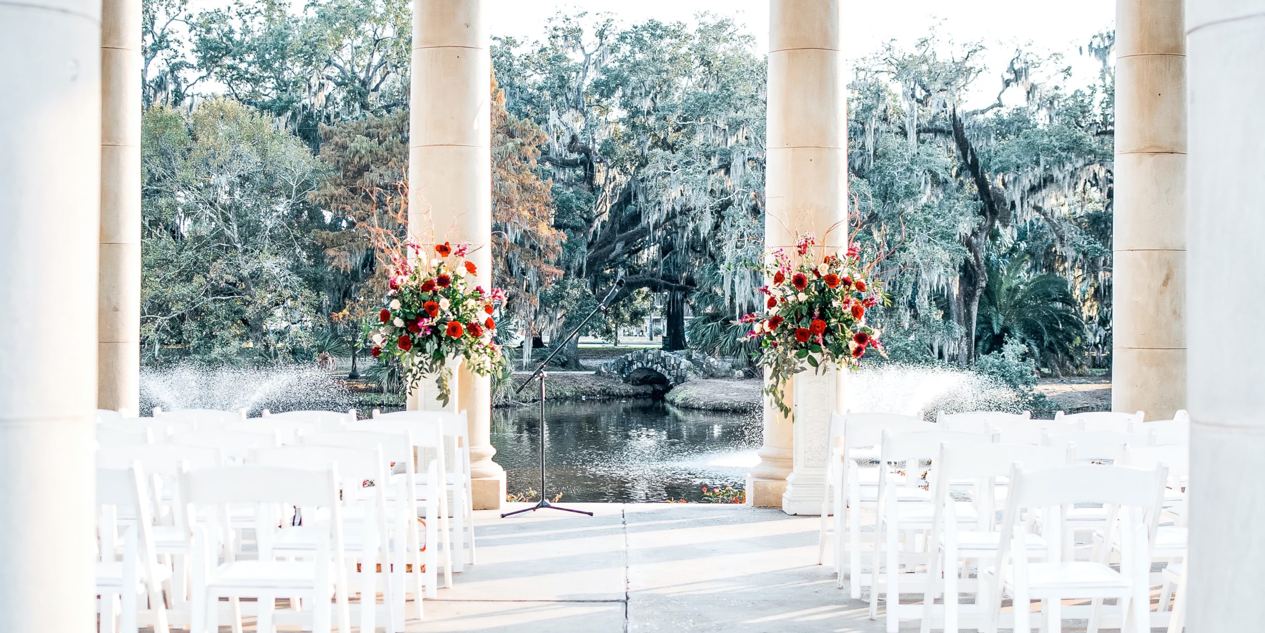
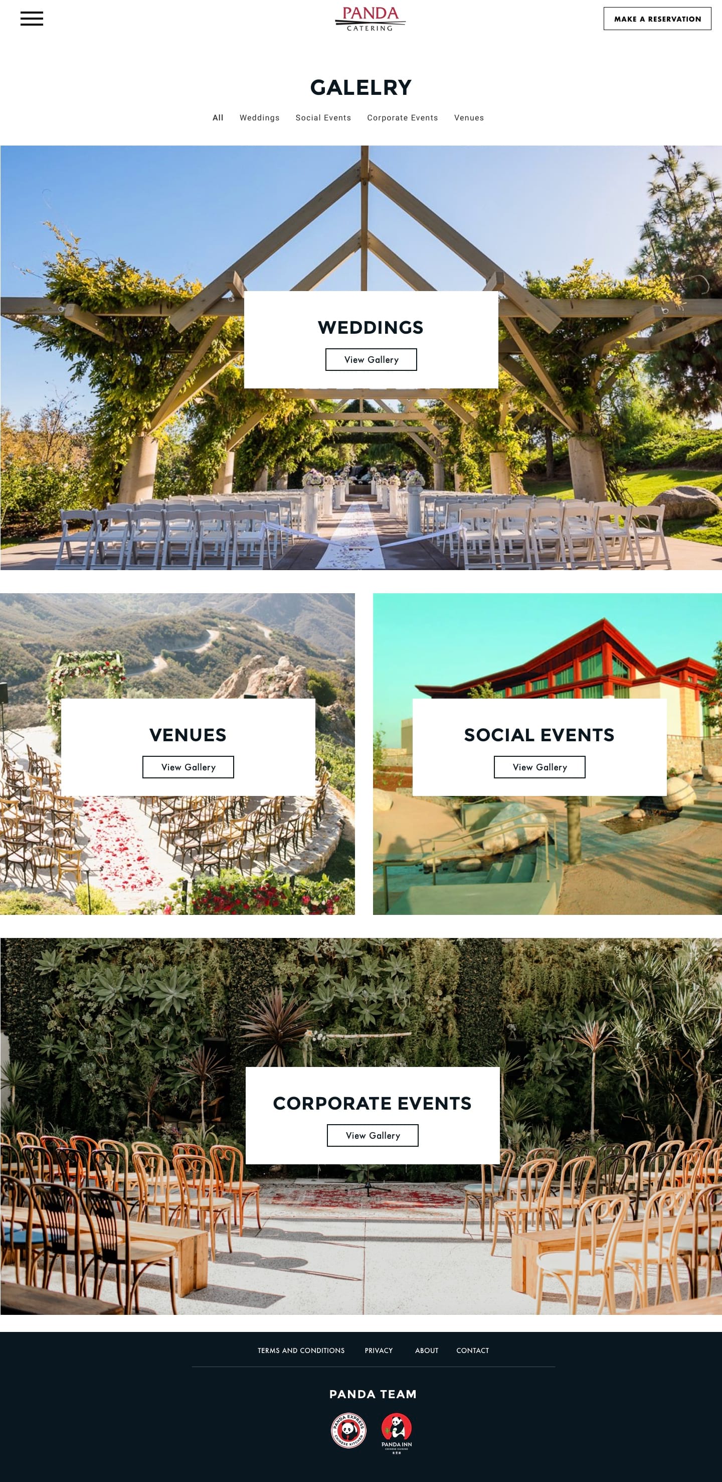
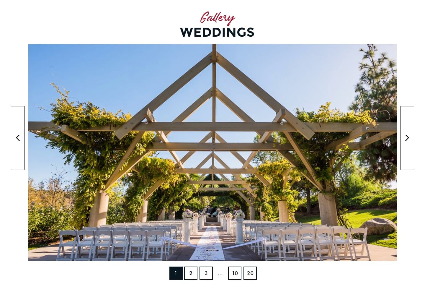
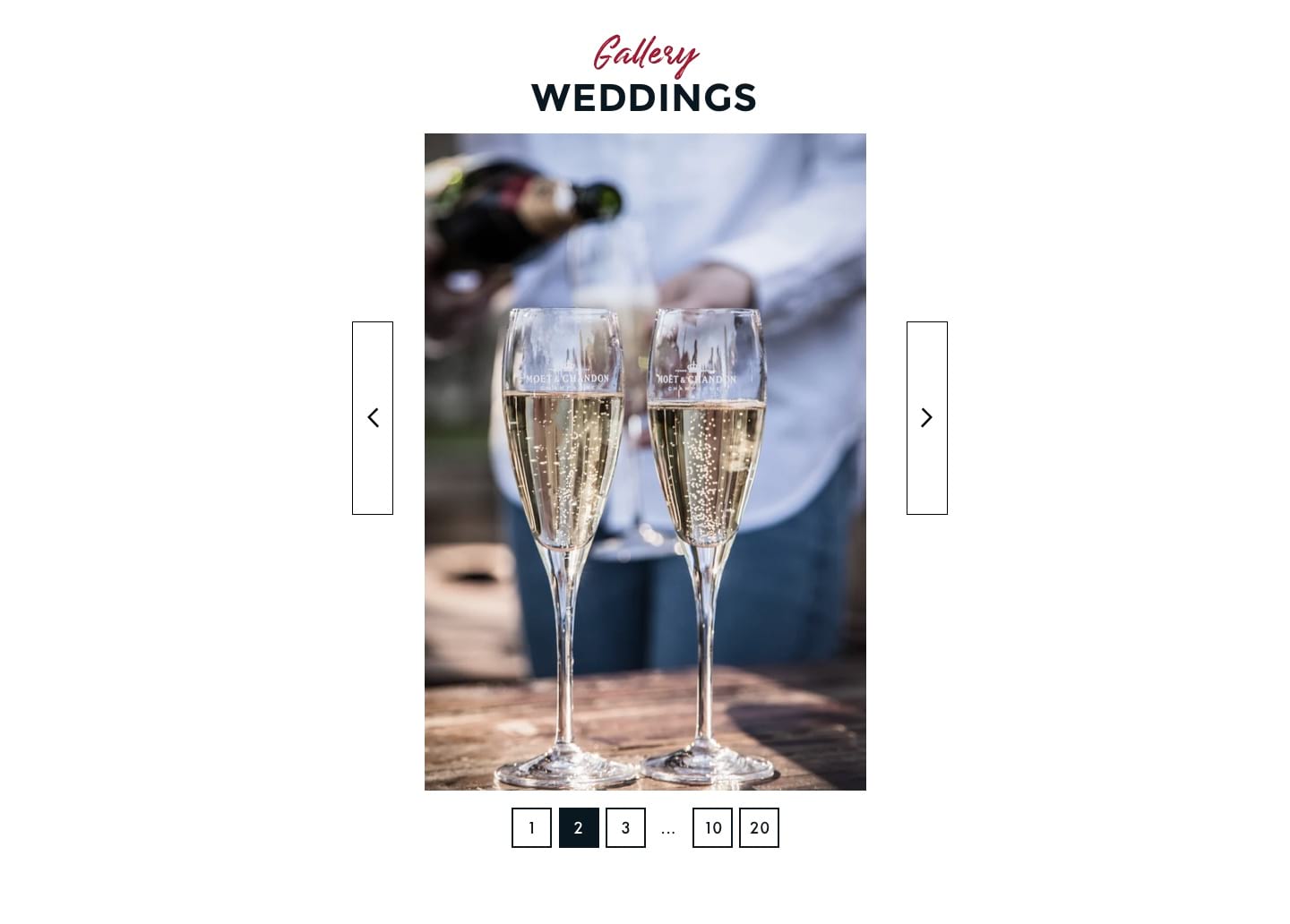
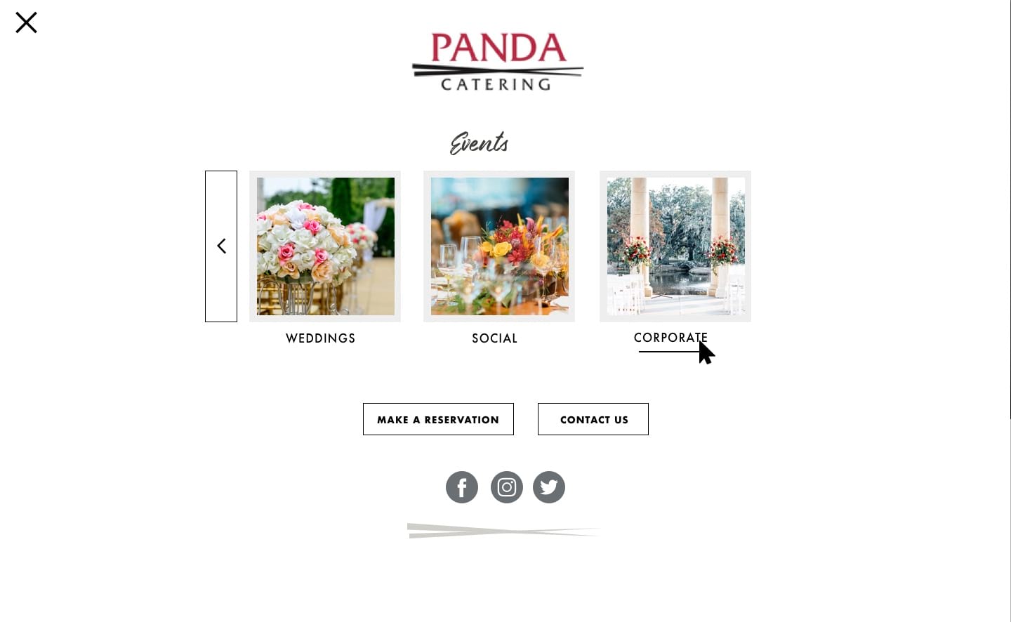
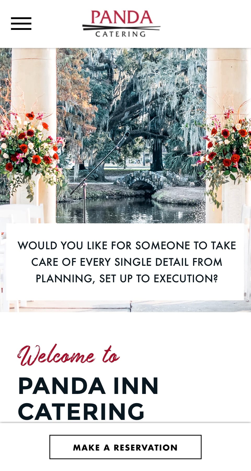
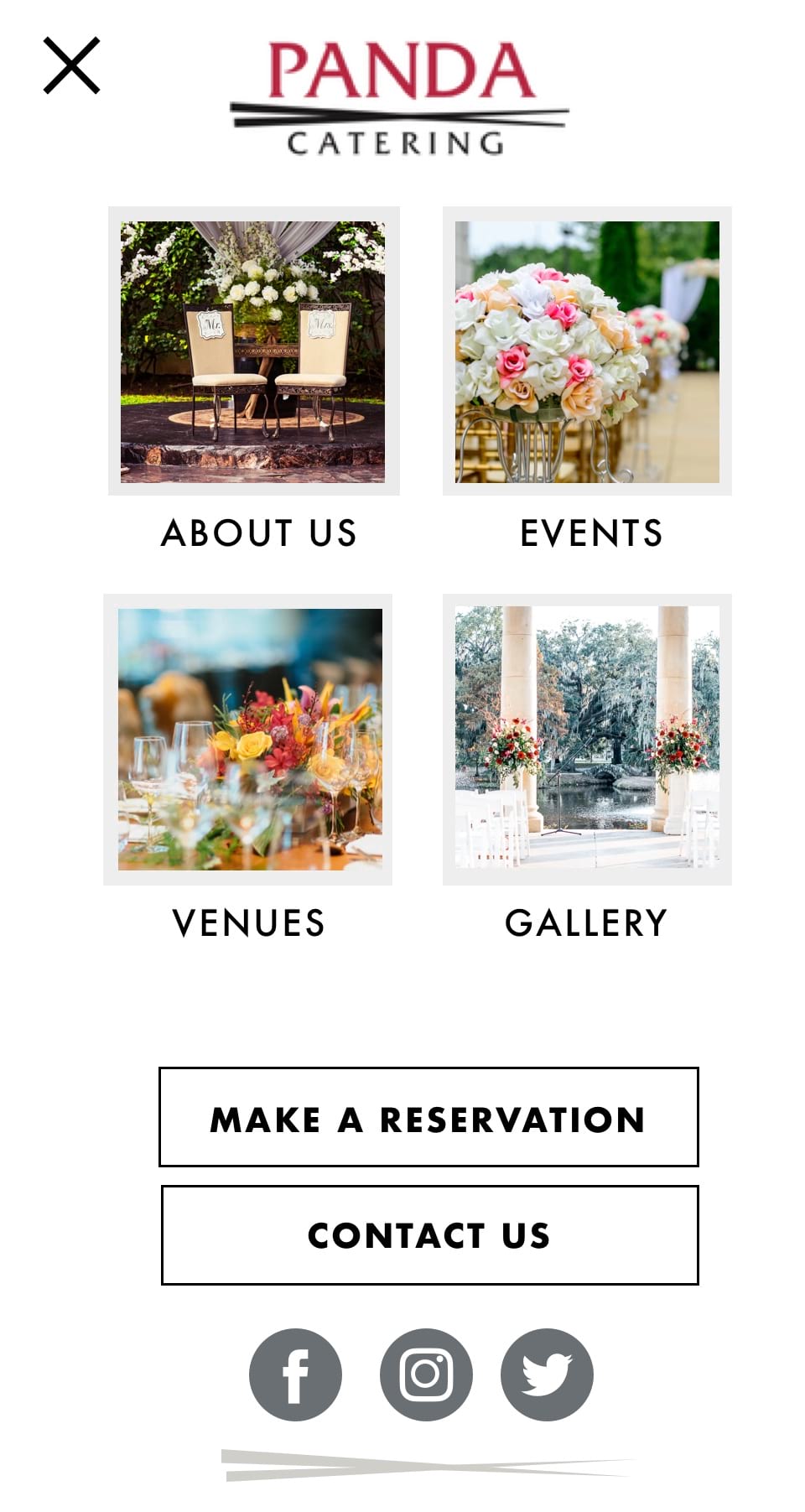
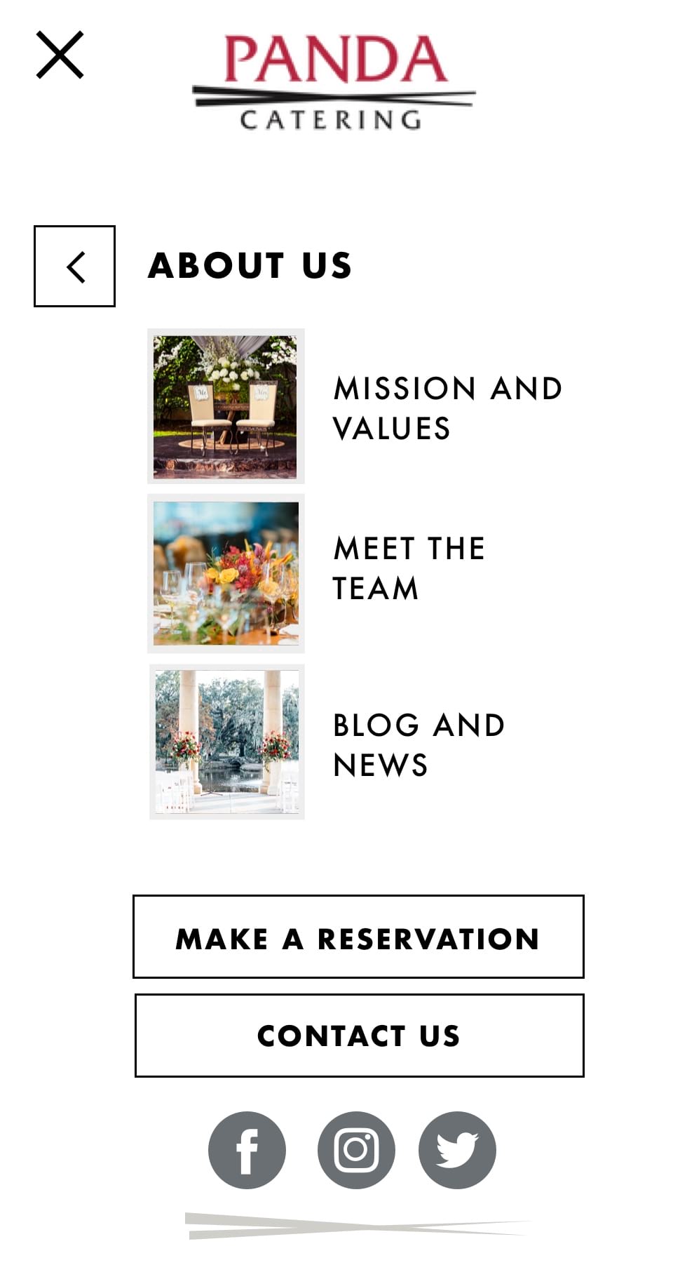
Panda Catering, a branch of fast-food giant Panda Express, asked WOOBRO to re-design their website, specifically to enhance its visual appeal to consumers. The client had a clear vision of what they were looking for, and we delivered. The texture and feel are minimal, with the primary focus directed towards their photos. This creates a clean and simple feel to the website.
Another goal was to ensure the website back-end is accessible and intuitive for the Panda Catering team so they can update content regularly and easily.
The whole process of working with the WOOBRO team was seamless. Even though there was a time difference, they were always responsive and always answered all of our questions. Thank you so much for developing a new website to showcase our portfolio of events and services. The elevation of the website has enhanced not only how our food looks, but also the service we provide guests and I truly believe guests that visit the website have a feel of what we have to offer. We absolutely love it!
UI Design
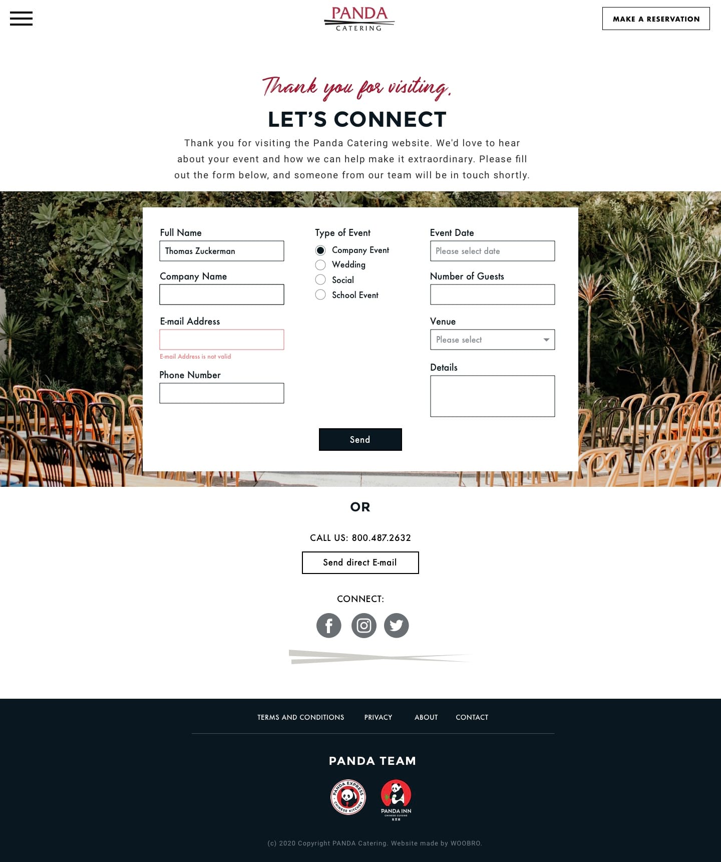
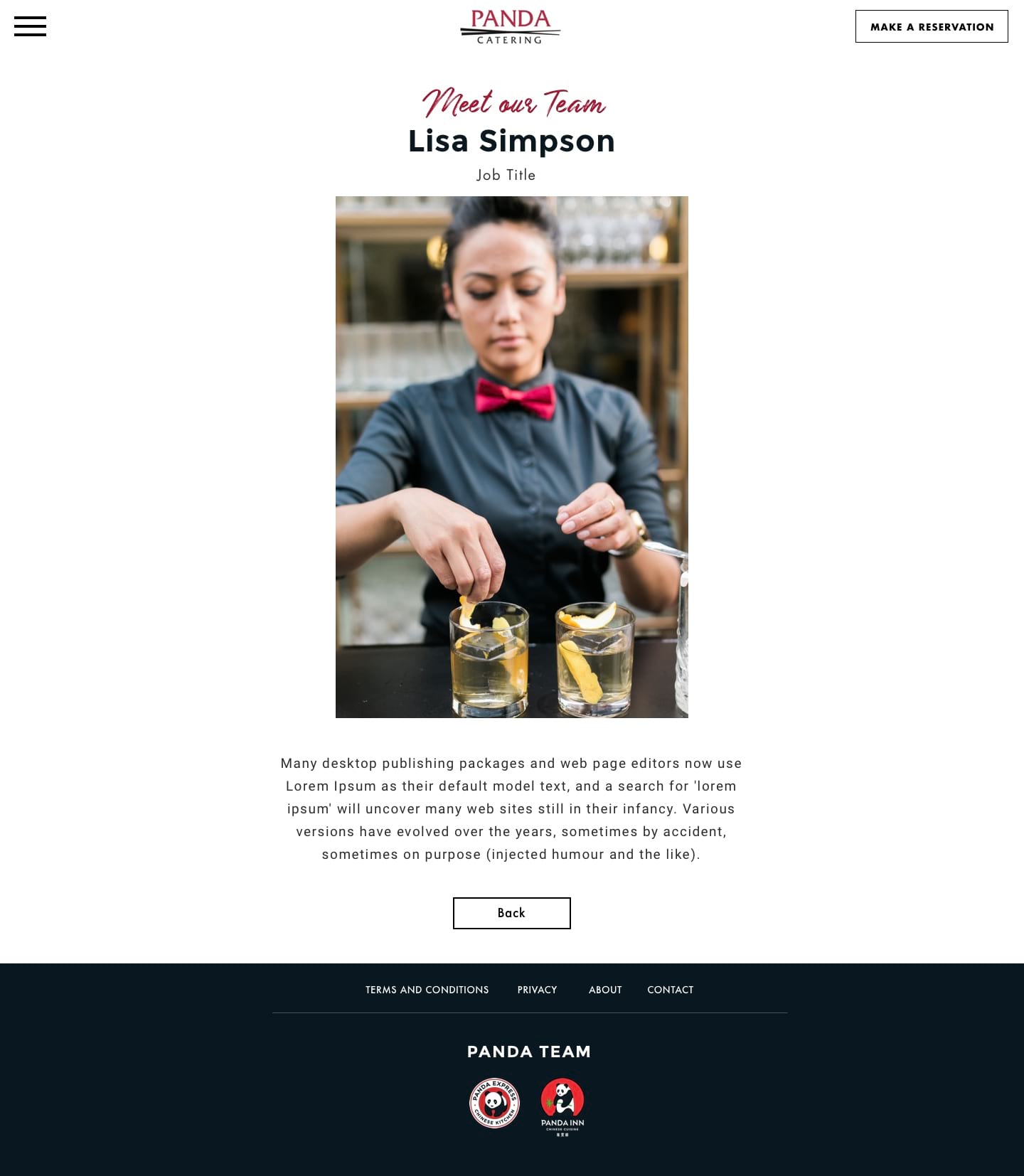
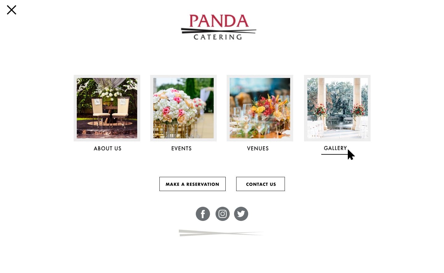
After both teams agreed on the information structure for the website, we started work on the visual designs. Colours, fonts, and illustrations were all chosen to appeal to Panda Catering’s consumers. We worked very closely with their team at every stage of the development.





Interaction Design
Using page transitions and animations we make the website more engaging.

